The Evangelical Free Church
of Manassas' Web Site
We suggest that you visit the web site for The Evangelical Free Church of Manassas and tour around it for a while. Then come back and read the review. Feel free to write us with your comments or criticisms at feedback@hartsem.edu.
 
Note: This site has been redesigned since this review was completed August, 2001.
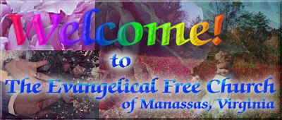
Review: When looking at the site for the Evangelical Free Church of Manassas, the display is evidence that a great deal of time has been spent creating this site. The site creators have carefully considered a range of information that the average online visitor will be looking for. A pleasant logo-like picture meets your eye as the site opens and you read general information about the church. Most importantly, the bottom of the page lists the church worship location, pastor’s name and email, information vital to new visitors and those seeking information. We would recommend, however, that the links for the Bible search and other tools that conclude the page be placed only on the links section of the site rather than the home page to avoid clutter and shorten the length of your main page.
This site is designed in frames, which we generally recommend using only when you have specific intentions in mind. As a reminder, one detriment to working in frames is that your visitors are unable to bookmark individual pages within your site. Another consideration is if the individual visiting your site has a smaller monitor or has their browser window set smaller than average, then the navigational bar that sits on the left of this site becomes cramped and will appear with a scroll bar. The navigational bar is appealing but appears to have its content ordered by text length rather than the relevance of its content. The site creators may want to consider ordering their pages beginning with general information on the church on down to more specific details and concluding with their resources and links.
Within these links, a visitor will find pages of information that help to form a mental image of the congregation. They present the church’s vision statement, information on its youth and adult ministries, and news of upcoming events. One thing all web designers should keep in mind is to maintain consistency throughout your content. For example, their navigational bar link is marked "vision statement" yet additional links at the bottom of each page refer to that page as a "purpose statement." Using consistent terms allows for both regular and new visitors to have clear understandings of what your site is trying to say. Also, it is important to remember not to underline text within your site unless it is indicating a link to other information. There are several places in the events page where text is underlined to provide emphasis or to denote a scripture reference. Instead, we would recommend either bolding the text or possibly using larger font size. Ideally, you may want to re-evaluate your layout’s for design qualities to emphasize what you want people to know.
The Pastor Q & A section is a wonderful resource for specific questions on how the church works and what the congregation supports and believes. The links and resources are also valuable but the site creators may want to consider merging the two pages into one. By listing out the links on one page, the current setup of clicking on a general category and opening another page that actually contains the links can be avoided. In addition, these links open within the current frame of the site so you are unable to determine the actual address of these new sites for possible review later. This can be fixed by indicating that the link should open in a new window or a new page so visitors will always be able to return to your site but can easily navigate around the site you have provided for them.
Overall, this web site is useful and shows great effort on the part of The Evangelical Free Church of Manassas to establish a web presence. The feeling and image of the church could be better portrayed by including pictures of the building, the pastor, staff, and members. Content could be more greatly enhanced by providing bios on the pastor and staff and more in-depth information on their ministries and missionaries. It appears as if the site is not regularly updated which may mean they are dependent upon an individual to update the site when they are available making it difficult to keep on top of changes and additions. We commend The Evangelical Free Church of Manassas for setting up their web site and providing information helpful to visitors!
|
