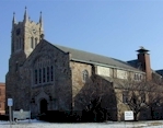
The Congregational Church
of West Medfords' web site
We suggest that you visit The Congregational Church of West Medfords' web site and tour around it for a while. Then come back and read the review. Feel free to write us with your comments or criticisms at feedback@hartsem.edu.

 Congregations that decide to have a web presence have the daunting task of determining what their visitors will want to know and yet be visually pleasing. The website for The Congregational Church of West Medford welcomes and informs you while giving the visitor the opportunity to get to know the congregation and what makes it tick. Congregations that decide to have a web presence have the daunting task of determining what their visitors will want to know and yet be visually pleasing. The website for The Congregational Church of West Medford welcomes and informs you while giving the visitor the opportunity to get to know the congregation and what makes it tick.
The visual design of the site is simple and clean, an advantage in combating the heavily animated web sites that appear so often on the web. Visitors are greeted by a framed color bar, which contains the church name and navigation system. The navigation bar provides an excellent breakdown of the various areas of interest that either a stranger or long time member may have. A few small problems are noted in the navigation bar. One is that "Labyrinth" is spelled incorrectly, an easily correctable problem. The other note is one of greater significance and should be a concern of every web designer. The frame designed to contain the church name and navigation system is not set to alter itself according to the size of the viewers’ browser window. In other words, the smaller your browser window is, the less of the navigation system will be visible, potentially eliminating potential links to key information. This may not be a noticeable problem for most visitors. Those who may have a 15" monitor and are using internet access that contains banner ads however, may not be able to expand their window large enough to view all of the navigational options or the entire church name. Although it may deter from the attractiveness, West Medfords’ webmaster may choose to have scroll bars appear if needed or opt to have the frames resize themselves according to the browser window specifications. If there is concern regarding the spacing when the frame is altered, then they may want to consider condensing some of the navigational topics. An additional suggestion is to add a text version of the navigation within the body of the site.
Beyond the framing problems, this site is a model example of the informational tool that online surfers hunger for on the web. The CCWM site provides clear and easy to understand information about who the congregation are and what they believe. The site describes their history and the grass roots beginning of the church, providing historical pencil sketches of the grounds. The congregations’ beliefs are clearly stated offering links to the United Church of Christ home page and to bookmarked pages within the UCC site that solidify their standing on various issues. The section on upcoming events is obviously maintained on a regular basis as is the home page which lists the events for the week. Visitors can truly feel informed since it appears as if careful thought went in to writing detailed descriptions such as offering the order of a typical service. Finally, the page dedicated to photos brings the visitor close to home and shows them the face of the church through its members and church building. Disabled, hearing, or visually impaired guests can also feel welcome since the church makes a point to state that assistance is available for them.
Within the plethora of information that West Medford offers, they must be careful not to underline non-hyperlinked text which can confuse some web surfers who think the text must take them to another section. They may also consider providing email addresses or contact information on their staff page and also within the pages describing various departments and ministries. We’ve also noticed some departments do not specify the key person within the department, how to get in touch with them, or how to get involved. This is not a problem for the veteran attender but may inhibit new comers from participating in those activities. In the future, more interactive features may be added to better involve all visitors to the site.
The West Medford Church might consider enhancing the content for church members by providing links to outside information such as things to do in the area, resources on the web for a variety of interests, or links to other groups with which CCWM works closely. Regular members may find the site useful but new information and resources will keep them coming back. For instance, the section on the congregations labyrinth and the resource links are quite extensive and work bookmarking.
Especially impressive is the request for website feedback on the bottom of the home page. Asking for your input, they link you to an evaluation form which guides the viewer into answering key questions important to the design of the site.
Visitors and members alike will appreciate the content and straightforwardness of this site which clearly shows that the congregation cares about its members and visitors. We commend the pastors of The Congregational Church West Medford, not just because they are Hartford Seminary Doctor of Ministry students, but because they have created a site that extends the culture and lifestyle of this congregation onto the web in an inviting and informative way.

|
