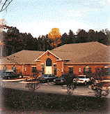
Colonial Baptist Church's
Web Site
We suggest that you visit the Colonial Baptist Church web site and tour around it for a while. Then come back and read the review. Feel free to write us with your comments or criticisms at feedback@hartsem.edu.


Review: We are partial to a clean, simple design which Colonial Baptist’s web site exemplifies. Although minimal in its front page, we were struck by its lack of clutter and excellent use of white space. It is almost elegant in its simplicity. Yet this understated entré into the congregation conveyed a friendliness and warmth that was immediately inviting. Clearly someone had thought long and hard about what they wanted the web site to imply about their congregation.
Much of the time we recommend congregations avoid moving or blinking images, but Colonial’s "windows into the congregation", appearing in the center of the front page, are an exception. They compliment the design rather than distract the visitor. The images again portray a friendly invitation into the online congregation. We also found the daily scripture and memory verse function on the first page to be a good hook into the site.
The navigation bar header provided an excellent and logical way to travel around the site. We liked the background faces and the slogan implying the site was committed to "building people." We thought, however, the hyperlinked button could have stood out more – perhaps with a less subtle hover color, and a color change to the corresponding button when you were on that particular section.
The site offers several features which contributed toward fulfilling its promise to "build people" such as its detailed section on what they believe, the text and audio sermon archive, an easy-to-use member directory, and a very nice page of resources. Unfortunately, the church seems to be having trouble with its calendar program and its "communique" section – the church’s newsletter – since both these links to major sections of their site were nonfunctional. We think this well-designed and technologically advanced site could further enhance its ability to build people if it had more interactive features such as discussion boards, a prayer request section, and perhaps more ways to connect directly with missionaries and ministry leaders. The guestbook, however, was a nice feature, with many complimentary comments about the congregation. Additionally, they may want to consider adding more pictures of their location and providing more details about the planned new facility to give visitors a feel for what it is like to attend their church. We found a wealth of information but only after spending considerably more time than the average user. Without an obvious site map, it was difficult to obtain an overview of all the treasures that lie within the site.
Our least favorite aspect of the site, by far, was its use of frames. Personally, we dislike their usage, but beyond our design preferences, there are several places on this site where the frames make it difficult to navigate or link between sections – not to mention the impossibility of bookmarking, say, the "resources" section for frequent use. One example of where the use of frames hinders the movement throughout the site is on the ministry section. If you visit the adult ministries but then want to jump to the youth section you either must use the back arrow or click on the "ministries" button on the header and begin again.
Overall we found this site to be well-planned and well-executed. We were able to learn about the congregation, its events and its mission. We are happy to offer the senior minister flattery about the site that he does not seek, at least according to his comments in his online greeting. But we also think this site does a good job of accomplishing the minister’s wish that the site "represents the miracle of God's grace. [God’s] putting together quite a family."

|
