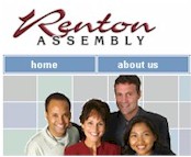
The Renton Assembly Web Site
We suggest that you visit the web site for Renton Assembly and tour around it for a while. Then come back and read the review. Feel free to write us with your comments or criticisms at feedback@hartsem.edu.

Renton Assembly, located in Renton, Washington, is clearly looking to reach out to its members and community via the web. They achieve this through the use of simple design patterns and soft muted colors. Understated websites have the ability to make a significant visual impact and allow even the most unfamiliar guest to feel welcome. Renton, Washington, is clearly looking to reach out to its members and community via the web. They achieve this through the use of simple design patterns and soft muted colors. Understated websites have the ability to make a significant visual impact and allow even the most unfamiliar guest to feel welcome.
Visitors are greeted by an entertaining flash production of photos and phrases on constant display directly under the main navigation. It may be recommended that the flash demonstration cease after 60 seconds so it would be less distracting from the content of the home page. This home page exemplifies the important use of white space and the goal to keep information uncluttered and easy to read. It should be noted that the main body text on your home page is vital in capturing visitor’s attention. This is where you can sum up your congregation in a few short sentences and invite guests to look deeper into your offerings. The center of the page for this site lacks any kind of welcome or information that may entice you to probe the site further. However, a wonderful feature is the weekly posting of what’s going on at their church and (at this particular date of viewing) an announcement of a significant upcoming event. This information is perfect for giving members and visitors a quick idea of some of the activities that the church sponsors. The web planners may want to consider shortening the length of that table of information and adding a brief welcoming paragraph with potential links of interest for the average “non-attender.”
The secondary pages serve as excellent resources for clearly understanding how Renton participates with its members and community. The designers continue the same color scheme at these levels and list a new left-side navigation within each section for more information. Although it is easy to find what you are looking for, you may find the content incomplete and lacking the description you are seeking. For example, when probing for information on the Senior Minister, you are only offered a phone and email address as opposed to a biography. In past reviews, we have emphasized the importance of content. We continually recommend that church web planners join forces with ministry leaders to provide as much significant detail regarding church policies, practices, and people. You would be surprised how many long standing members may not be clear, especially in large churches, on how a certain ministry works or the personal information of the leaders they support. This is especially important in the counseling section where some groups are lacking informative descriptions. With this particular ministry area, you have to recognize that people may not seek the counseling assistance they need because they fear the unknown. Websites are an excellent tool to inform and relax potential participants by assuring them in writing that you are designed to serve their best interests.
The web planners should be commended on the events section of the site. This page allows you to view what is coming this week and even advance the calendar provided to see what events are planned for the upcoming months. Furthermore, as the listings appear to the right of the page, a link is provided to read more information about the activity.
Overall, the site is warm, welcoming and clean and achieves the purpose of informing their visitors without confusing them. A few notes worthy of consideration: we noticed a few typos on several pages – be sure to spell check your work before you post. Also, we would have liked to see pictures of the members, activities, and church building to give a personal feeling to the website. A great spot for a small picture of the building would be the top right corner of each page, which would help to balance the broad block of white space at the top of the page. One very important note that is always at the forefront of our reviews is the use of frames in your page layout. This site is designed in frames, which will not allow visitors to bookmark sections like “events” for quick retrieval. We don’t recommend using frames except in highly specialized situations in which a frame would suit the information you are presenting.
The Renton Assembly congregation should be proud of its website and the inviting presence it has established. With some small additions, this site can serve as a vital tool of information for both members and newcomers alike.
|
