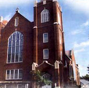
The Zion Church Web Site
We suggest that you visit the web site for Zion Church and tour around it for a while. Then come back and read the review. Feel free to write us with your comments or criticisms at feedback@hartsem.edu.

 Understated simplicity is always likely to win over viewers who may be weary of reading complex items throughout their day. Although some businesses and congregations may choose to enhance their site with interactive elements, dancing images, and flashy colors, that style is not always necessary nor helpful when welcoming visitors into a web site. Understated simplicity is always likely to win over viewers who may be weary of reading complex items throughout their day. Although some businesses and congregations may choose to enhance their site with interactive elements, dancing images, and flashy colors, that style is not always necessary nor helpful when welcoming visitors into a web site.
Zion PCA exemplifies simplicity on their home page by providing just what is necessary: a brief description of the church, special highlights, the service schedule, and a basic navigational system to provide you with further information. The navigation is clean and easy to follow giving visitors the opportunity to further explore the dynamics of Zion.
One important achievement is that the home page is succinct enough to fit within a small screen size. The impact of your home page might be lost if viewers have to scroll from left to right to view the entire home page. When possible, web designers should attempt to make the home page a size that surfers with even the smallest monitors can view entirely. Although this may be difficult to achieve with the height of the page, it is quite feasible to adjust the width of your page to accommodate different screen sizes.
This home page design is carried throughout the secondary pages providing an almost equal split in the middle of the page with the left side dedicated to the navigation options and general information and the right side dedicated to providing the content. It remains attractive and easy to read, however, we often recommend a slightly different look to your secondary pages simply to alert the visitors that they have gone through a door to another section of the site. This can be done simply by incorporating the use of color to denote a certain section of the site. Another suggestion, in this case, would be to change the look and location of the general information (service schedule, updates, and contact) that appear below the navigation. This will also catch your viewers attention and make them aware that they have arrived to the part of the site they were seeking. Of course, a unique look for secondary pages should be a standard for all of the secondary pages as there is no need to change the style of each section or page. For example, by using the color maroon to splash some color in the "ministries" section or green to spruce up the "about us" section, a certain atmosphere will be projected in each division of your site.
It’s evident that Zion is a caring church with their mercy ministries dedicated to providing food to those in need. They provide clear and concise descriptions of their ministries and additionally provide a link back to their calendar so that visitors can stay abreast of current happenings.
The "Hot Sheet" listing the weeks events is a wonderful way of letting visitors quickly find out what’s happening and the online newsletter keeps members in touch with their community.
While Zion does an excellent job of establishing their identity for their visitors they should also consider dedicating a section of their site to further information on their pastor and staff. This gives newcomers a better idea of the leadership structure of the church and puts faces on what begins as a faceless organization. Zion may also want to include candid photos of church members or church activities to further the sense of community and togetherness that churches often provide in their face to face interactions.
We also noted that the several of the pages, especially within the sermon section, gave a generic "under development" message. This is understandable since the statement does reflect that the site is new. However, it is important that the web technician attempt to provide some information within those pages by a certain time period so visitors do not become discouraged from visiting those sections. Zion could also make a brief announcement on their home page when the sermons do become available to grab viewers attention to new features to the site.
Overall, Zion’s simple and clean design makes for an effective website and informative to both members and non-members alike. We hope they continue their efforts to maintain the strong web presence they have established.

|